NormalizationPreview: Difference between revisions
imported>MichaelDondrup No edit summary |
|||
| (3 intermediate revisions by 2 users not shown) | |||
| Line 6: | Line 6: | ||
=== Example === | === Example === | ||
[[ | [[File:normpreview.png]] | ||
What does the | === What does the colored plot mean (sorry, there is no legend so far)? === | ||
The plot depicts logarithmic intensity ratios (M-axis) over log-overall intensities (A-axis) for each spot. | The plot depicts logarithmic intensity ratios (M-axis) over log-overall intensities (A-axis) for each spot. | ||
* M = | * M = log<sub>2</sub>(CH1)/log<sub>2</sub>(CH2) | ||
* A = 0.5* | * A = 0.5*log<sub>2</sub>(CH1 + CH2) | ||
Every dot represents a single spot intensity. The dots in black represent spots wiht M-values within [-1,1]. Colored triangles represent spots with intensities above or below 1 or -1, representing a 2-fold intensity ratio on linear scale. | Every dot represents a single spot intensity. The dots in black represent spots wiht M-values within [-1,1]. Colored triangles represent spots with intensities above or below 1 or -1, representing a 2-fold intensity ratio on linear scale. | ||
Latest revision as of 15:02, 26 October 2011
Results of a Normalization Preview
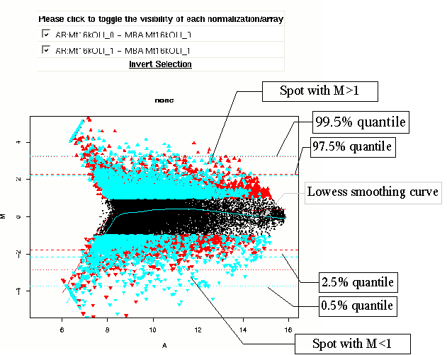
When you run a normalization preview analysis, and follow the link in the message of your job, you will see a page consiting of many images very much like this:
Example
What does the colored plot mean (sorry, there is no legend so far)?
The plot depicts logarithmic intensity ratios (M-axis) over log-overall intensities (A-axis) for each spot.
- M = log2(CH1)/log2(CH2)
- A = 0.5*log2(CH1 + CH2)
Every dot represents a single spot intensity. The dots in black represent spots wiht M-values within [-1,1]. Colored triangles represent spots with intensities above or below 1 or -1, representing a 2-fold intensity ratio on linear scale.
The quantile lines represent regions within which a certain percentage of the data can be found. The 0.5% and 99.5% quantile lines (dotted) mark the area containing 99% of the data. The 2.5% and 97.5% quantile lines (dashed) mark a region containing 95% percent of the M-values.
The lowess line at the center of the plot marks a scatter-plot smothing function for each of the arrays.
